Inspiration
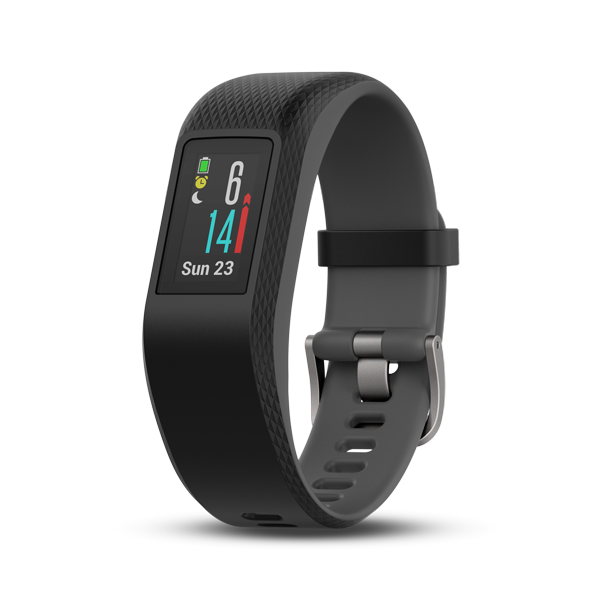
It all started last year when I decided to purchase a garmin activity tracker. The garmin Vivosport.
Main goal was just to track the quality of my sleep and to see I am moving enough.
Given I use my dear bycicle as means of transportation to go to work I decided to experiment with the activity tracker and its GPS funcionality. So every day in the morning, I have been recording my bike activity to go to work. The motivation for this has been the following:
- Check the differences on times between summer and winter (In Finland there is big periods with snow).
- Find the routes that are faster.
- Practice more with spacial data and have fun.
Getting the data
Partly thanks to the GDPR, many companies have been forced to make it accessible to share the data you generate online.In the following link you can ask for a link that will be sent to your email where you can download all the data in .fit format.
Thanks to open source R community, there is a package for that purpose.
From .fit files to data frame
First step is to load all the needed libraries
#devtools::install_github("jmackie/fitdc")
library(fitdc)
library(here)
library(tidyverse)
library(lubridate)
library(sf)
library(zoo)
library(mapdeck)
library(mapview)
library(jechaveR)
Then there are a bunch of functions that will be used later
So to read the files, we will start by collecting a list of all the files of type .fit together with the whole address.
list_fit_files <- list.files(path = "data/DI_CONNECT/DI-Connect-Fitness-Uploaded-Files/",
  pattern = "*.fit",
  full.names = TRUE)
Then, we take each of the fit files from the list gathered beforehand, and with purrr::map() read all the files with the fitdc::read_fit() function, that will provide some very simple data frame.
As fit files contain all kinds of data (not only activities), the read_fit() function throws some errors, that is the reason why the function is used together with safely() to stop the loop from continuing to read the activities. After that the files that throw an error are discarded, and useful information about the sport type recorded is put together in a data frame.
Final step is to transform the data into readable format (distance to km, timestamp to datetime, and position to degrees…) which is done by the function df_mutate defined above.
#Read all files safely, to avoid errors thrown by read_fit function
read_batch <- map(list_fit_files,~safely(read_fit)(.x)) %>%
  set_names(.,basename(list_fit_files))

#Save the lists that have a positive result and that are not null
good_batch <- discard(read_batch %>% map(.,"result"), ~ all(is.null(.x)))

#Get values from list
sport <- extract_unique_values(good_batch,"sport")
sub_sport <- extract_unique_values(good_batch,"sub_sport")

#Get data frames with "record" values in lists
good_batch2 <- good_batch %>%
  map(.,~Filter(is_record,.x) %>%
  map_dfr(.,"fields"))

#Put data.frame together
df <- tibble(
  file = names(good_batch2),
  sport = sport,
  sub_sport = sub_sport,
  data = good_batch2
)

#Filter activities with GPS data and mutate columns for graphs
coord_df <- df %>%
  mutate(contains_coord = map_lgl(data,
    ~ifelse("position_lat" %in% colnames(.x),TRUE,FALSE))) %>%
  filter(contains_coord == TRUE) %>%
  mutate(coord_data = map(data,df_mutate))
After this steps, we obtain the following number of activities by sport type.
df %>% group_by(sport) %>%
  summarize(n = n()) %>%
  arrange(desc(n))
## # A tibble: 7 x 2
## sport n
## <chr> <int>
## 1 <NA> 1571
## 2 walking 176
## 3 cycling 132
## 4 training 38
## 5 generic 30
## 6 running 23
## 7 NA 1From home to work
In this analysis, we are interested on only, a subset of the data, which is bike rides, from the appartment to work. We can do that by filtering the sport type and start and end points with the following function
point_in_location <- function(df,lat,lon){
  precision <- 0.001

ifelse(df$lat_degrees >= lat - precision & df$lat_degrees <= lat + precision &
    df$lon_degrees >= lon - precision & df$lon_degrees <= lon + precision,TRUE,FALSE)
}
This leaves us with the following routes, as it can be seen, there has been different routes taken during the control period.
route_gg <- ggplot(bike_home_to_work %>% select(-data) %>% unnest(),
  aes(lon_degrees,lat_degrees,fill = file)) +
   theme_jechave() %+replace%
  theme(panel.grid.major = element_blank(),
    axis.text = element_blank(),
    axis.title = element_blank())
route_gg +
  geom_path()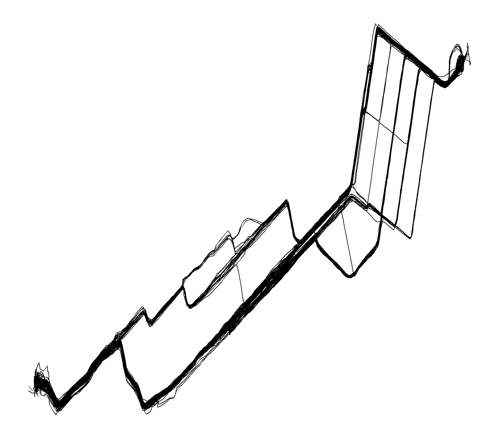
Thanks to ggplot we can do cool things, such as checking the heart rate evolution during the ride, it is clearly visible that in the start I am fresh but I end up at work with high heart rate.
route_gg +
  scale_colour_gradient(low = "green",high = "red") +
  geom_path(mapping = aes(color = heart_rate)) +
  labs(color = "heart rate (BPM)")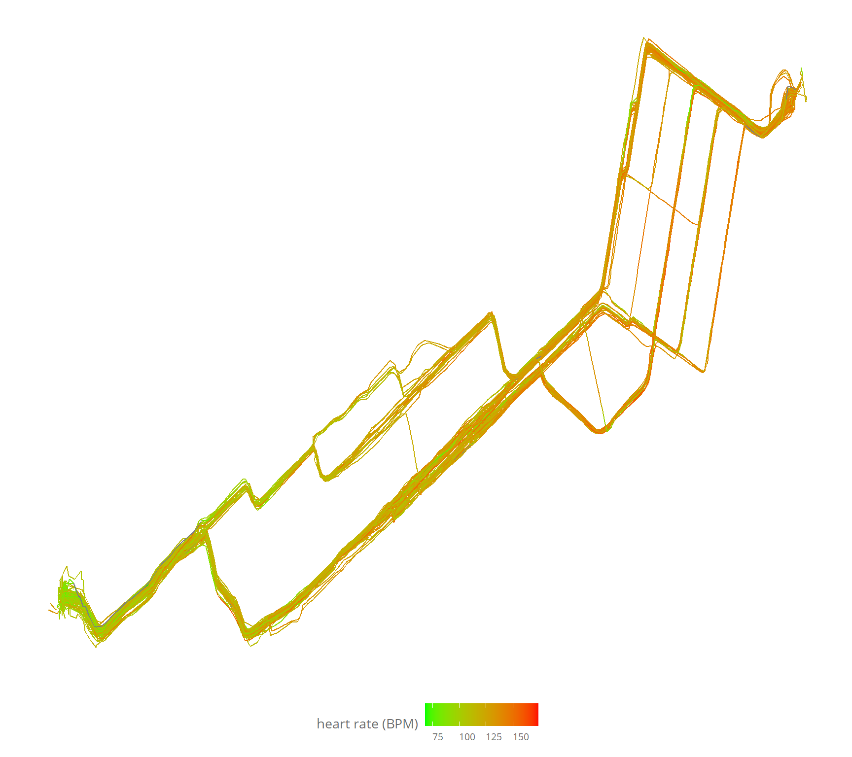
We have now the basis for answering the questions that motivated this project.
Winter VS summer
This last winter has been full of snow, there has been snow on the road for about 4-5 months. I bought the winter tyres on 3/12/2018.
As there are not a lot of observations (also I was not in finland for big part of December-January) it isn’t so clear, but by seing the points, but with a running average of 7 days, it is more clear the trend going down heavily in March. then on the start of April, there is a huge peak down, which relates to new city tyres, instead of the offroad tyres i was using on the previous summer, which reduced the friction a lot.
ggplot(rides_summary %>% filter(duration_min < 20)) +
  geom_point(mapping = aes(day,duration_min),alpha = 0.25) +
  geom_line(aes(x = day, y = rollmean(duration_min,7,na.pad = TRUE))) +
  geom_vline(xintercept = dmy("15/4/2019"),linetype = "dashed",color = "#6d6d6d") +
  geom_text(aes(x = dmy("15/4/2019"),y = 18,label = "Change to \nsummer tyres",angle = 90),
    family = "Open Sans",color = "#6d6d6d",size = 3.5) +
  # scale_x_date(breaks = "1 month") +
  theme_jechave() +
  labs(title = "Daily ride to work",
    subtitle = "Line represents 7 days running average",
    x = "Date",
    y = "Duration (minutes)",
    alpha = "")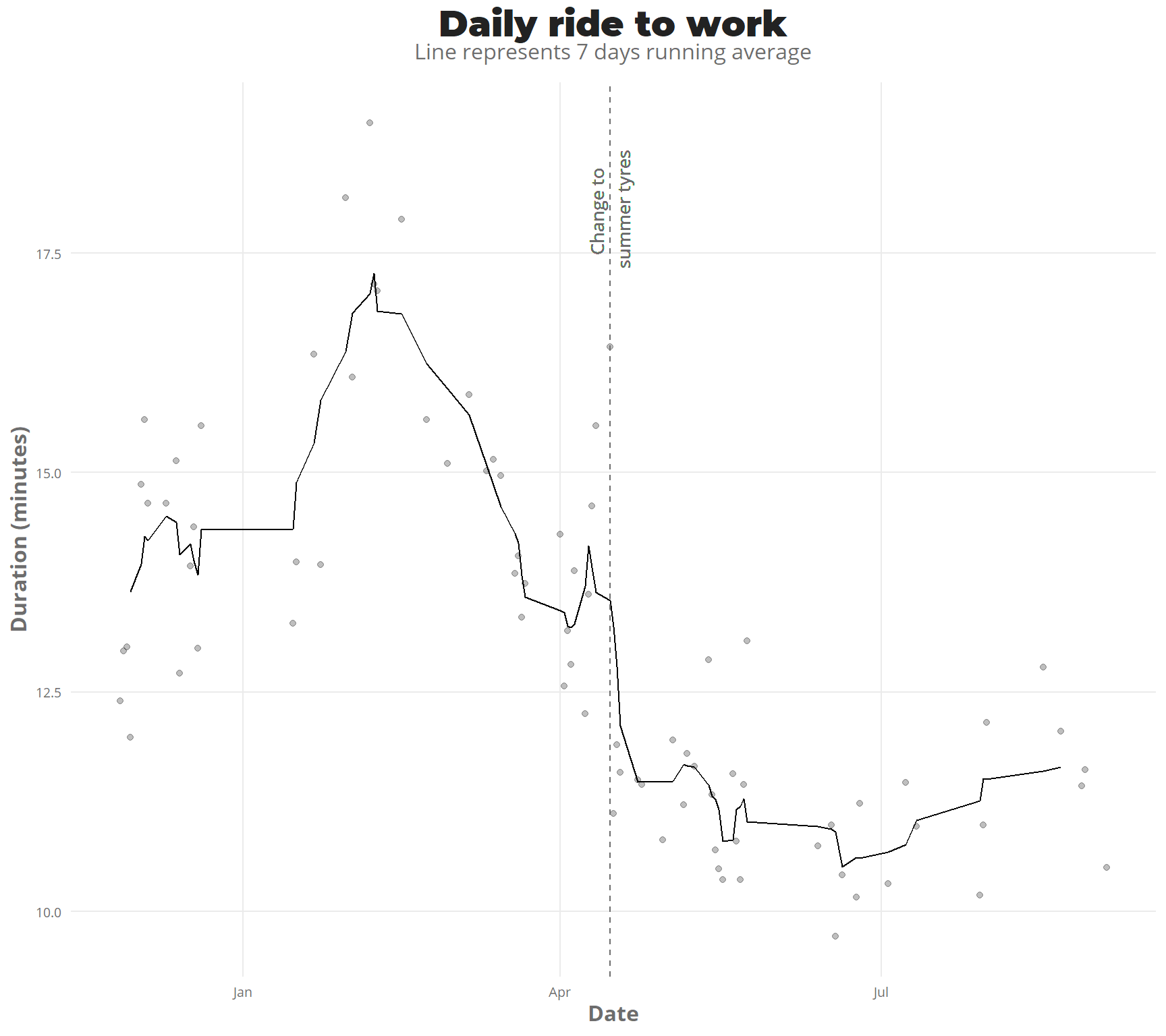
Fastest routes
Using this tutorial as a base i made some data wrangling, to get an sf object LINESTRING for each of the bike routes.
The sf object, makes it easy to plot with the function geom_sf. We can divide it by month to get a clearer picture, of progression
ggplot(nest_line_df) +
  geom_sf(mapping = aes(color = duration_min)) +
  facet_wrap(.~month(day,label = TRUE)) +
  scale_colour_gradientn(colours = terrain.colors(10)) +
   theme_jechave() %+replace%
  theme(panel.grid.major = element_blank(),
    axis.text = element_blank(),
    axis.title = element_blank())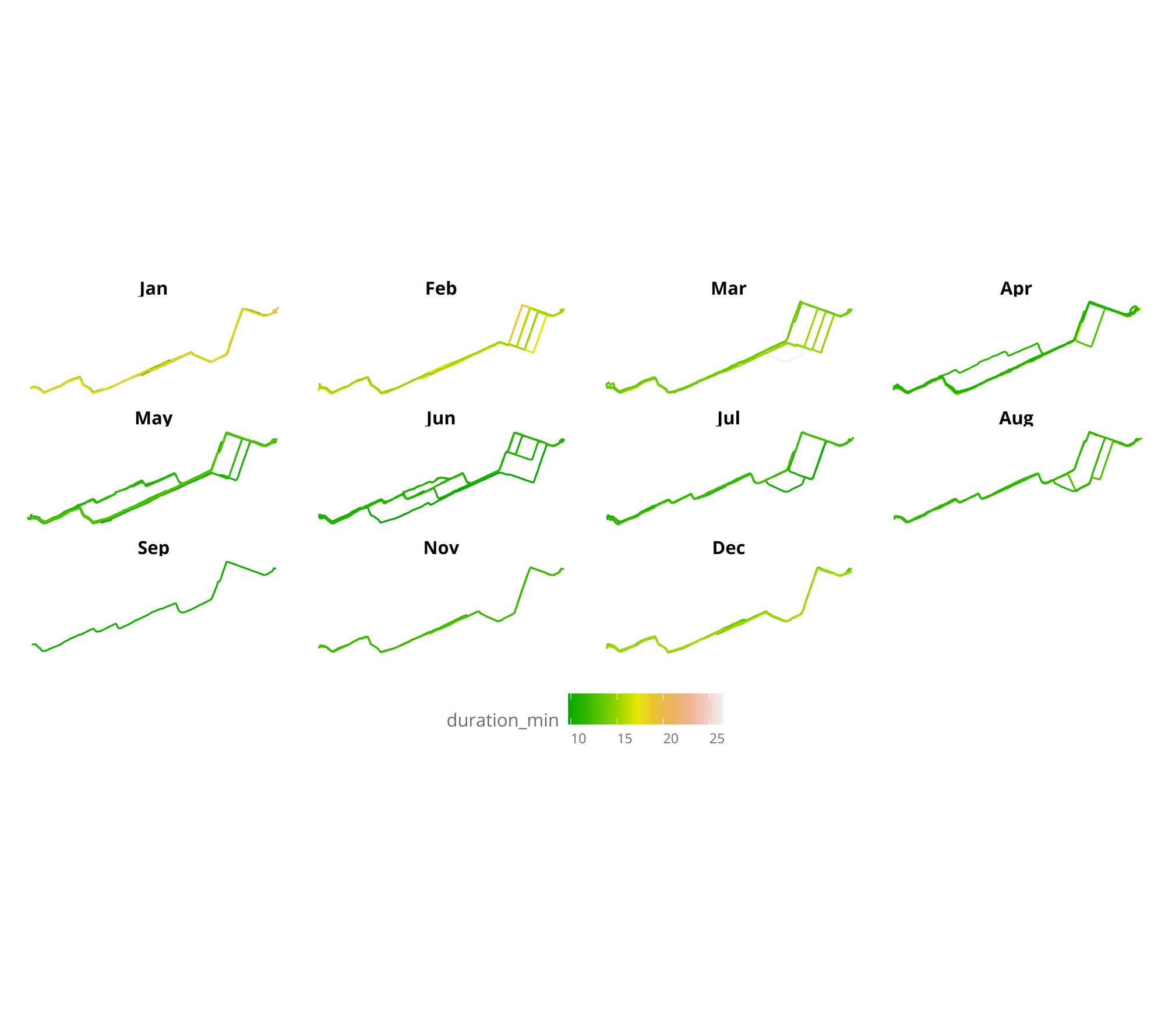
In the visualization, it can be seen that winter months are the slowest, and also that during April I started to go through a bit different route, to finally ending taking the same route everyday. Measuring the time almost everyday has made it clear that it is the fastest route (mainly as there aren’t so many traffic lights). But let’s plot the same, focusing only from April to August (all months without snow).
nest_line_df %>%
  filter(day > "2019-04-01",
    day < "2019-08-01") %>%
ggplot() +
  geom_sf(mapping = aes(color = duration_min),aes = 0.5) +
  facet_wrap(.~month(day,label = TRUE)) +
  scale_colour_gradientn(colours = terrain.colors(10)) +
  theme_jechave() %+replace%
  theme(panel.grid.major = element_blank(),
    axis.text = element_blank(),
    axis.title = element_blank())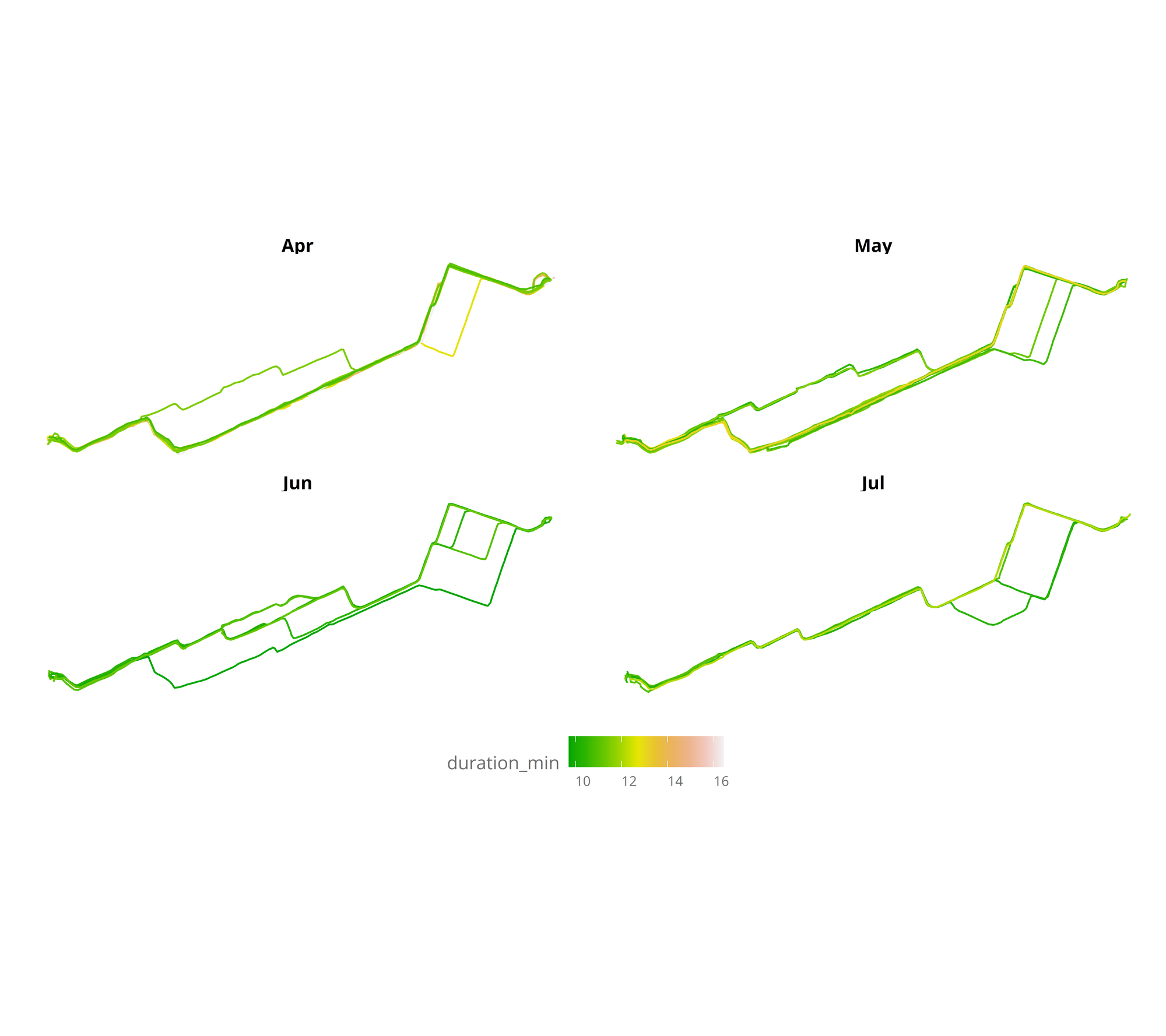
Finally I constructed a html interactive map (thanks to the super easy mapdeck package) to see the durations of different routes, where you can zoom the map and hover over to see the time for each segment.
Conclusions
Together with learning some of sf and sf packages as well as deeper understanding of nested data frames, this project was really fun, as working with data that has been created by is very interesting. I even got to understand the fastest biking routes, and now i do the same fastest route every day.